
General
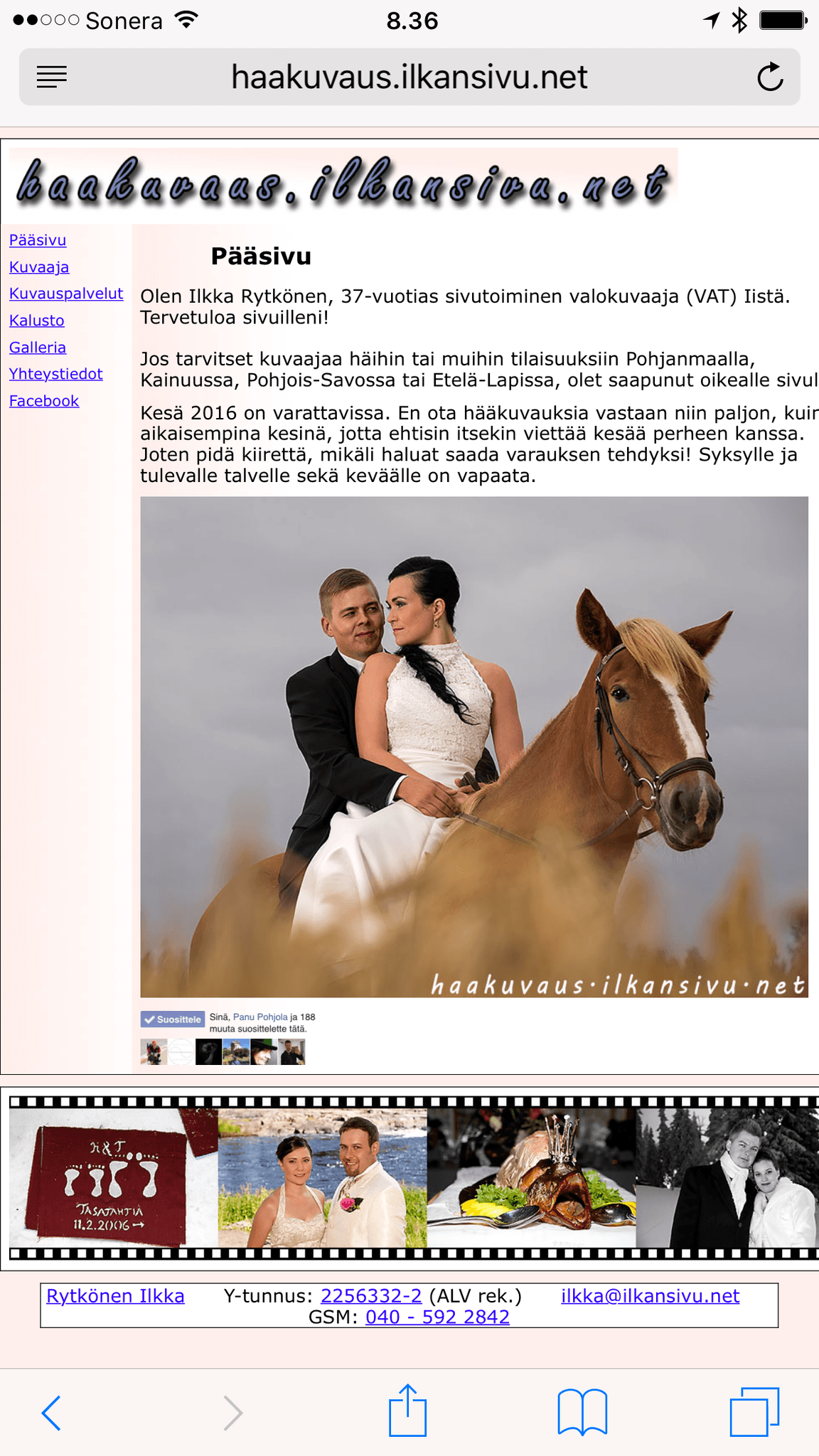
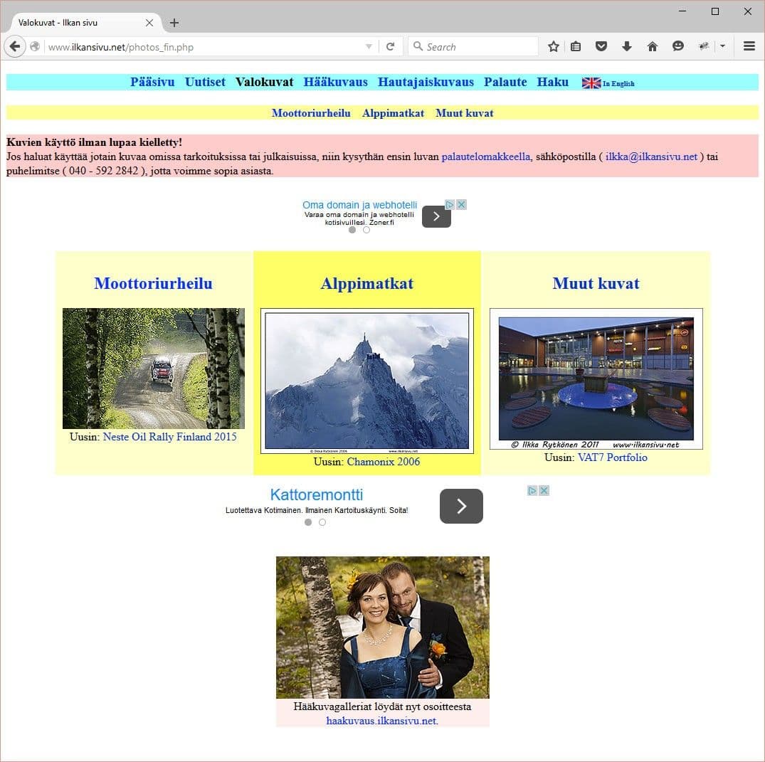
Today is the day when I finally got the new site finished and published! The previous site was based on a template of my own made in the last millennium. On top of the old template, maintaining the site was laborious and slow, and the pages no longer adapted to today's mobile era.
In the spring Google had already sent an email about problems with mobile use of the old site. So even Google thought my old site no longer belonged in this day and age.
Google systems have tested 1 770 pages on your site and found that 99 percent of them have critical mobile usability problems. The problems on these 1 760 pages seriously affect how mobile users can experience your website. Google Search does not classify these pages as optimized for mobile devices, so they are displayed and ranked accordingly for smartphone users. Google
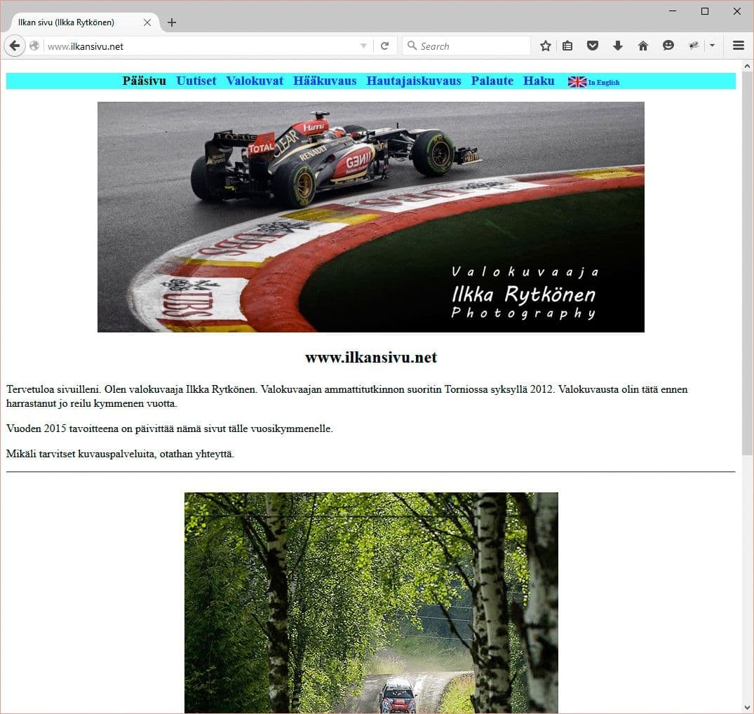
People no longer surf the net only on desktop or laptop computers, but increasingly on tablets and phones. If you want to sell something online or otherwise gain visibility, the site simply has to work on every platform.
It certainly was a lot of work to get everything wrestled to this point. Along the way I had to learn new technologies and programs, including the use of content management systems and Adobe Illustrator for making the logo.
I wanted everything to work within the same site, with the same user interface and logic. The blog too.
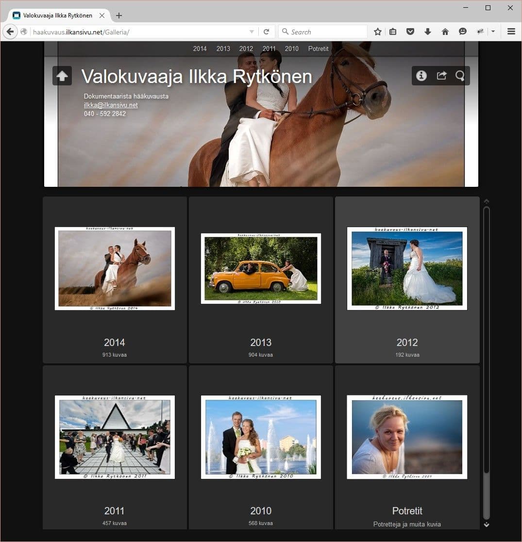
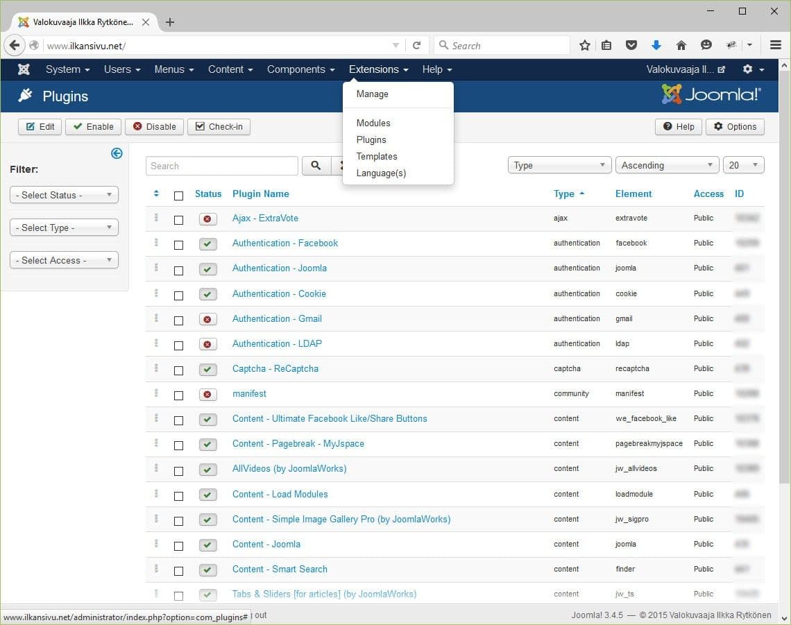
The site runs on a content management system called Joomla, which means all the texts and images come from a database. The image galleries run on two different add-ons. Finding a smooth and usable gallery took a lot of time and effort, but it was worth it. A photographer's site can't be good if the pictures can't be seen easily.
Other add-ons have been downloaded or bought as needed so that the pages look and feel the way I want them to. These include social media buttons, article rating stars, the ability to comment, and surveys.
I wanted everything to work within the same site, with the same user interface and logic. The blog too. You often see that when you click the blog on a site, it takes you to a completely different place and feels completely different from the rest of the site. I managed to hold on to this, with the exception of commenting. The code used for commenting on articles loads from the outside, but otherwise everything is under my own control.
Now everything is up and running in broad terms, and the pages seem to work well on every platform. There will of course be small tasks to do in the future too, but that's how it goes. Still, I can be satisfied at this stage.
The birth of the new site
It all started many years ago. The new site should really have been made earlier, but better late than never. While I was at school I bought the Adobe Creative Suite software package, which included Dreamweaver. Back then I thought I would start making pages with it. It would have been possible, but I began looking into other options too. Using Dreamweaver would also have meant studying HTML and CSS in greater depth. On the one hand that would have been interesting, but probably extremely time-consuming.
The same pages run both on traditional computers and on all mobile devices regardless of screen size.
There are various content management systems (CMS) on the market that work as the engine of a site. With them you can build a site without any great coding skills, yet they still give enough freedom to implement all sorts of things. They are not entirely plug & play, and you can't get the site finished the same day. Or maybe that is possible if the content management system is familiar and the material to be published is ready.
A modern content management system produces responsive pages, meaning the same pages run both on traditional computers and on all mobile devices regardless of screen size. You no longer need to make a separate version of the site for mobile phones. This clearly makes maintenance easier.
Choosing the content management system
Based on surfing the net, two content management systems stood out that seemed suitable for my needs. These were WordPress and Joomla. Both seemed to have their own good and bad sides, so the matter needed closer investigation.
Once I had some feel for both systems, I decided to build the site with Joomla.
Joomla then felt better to my way of thinking. I installed Joomla for the first time many years ago, when it was at version 2.x. I tried to get into the system. It took getting acquainted to learn how the platform works and to get pages showing.
Time passed and the planning of the site was in the background for a long while. At some point I returned to the subject and Joomla had been updated to version 3. I then installed the new version and started everything from scratch. I no longer remembered where I had left off. This time I had Lynda.com to help, and with its excellent Joomla 3 course I got a trial site to a very good stage.
At the same pace I decided to go through Lynda.com's basic WordPress course as well, and I made a test site with this other content management system too. Once I had some feel for both systems, I decided to build the site with Joomla.
WordPress would have offered an easier and more straightforward way of making a site, but I liked Joomla's way of doing things and how it works better. Joomla requires more getting acquainted, but it has its advantages.
The template determines the look
Once Joomla has been installed, its appearance is quite bare. With a little tweaking it does get a lot better. The default look probably won't please in the long run, but for a better look there are endless extensions on offer.
The PhotoSwipe image gallery is certainly one of the best image galleries I have used. Images load very smoothly and browsing them works nicely on phones too.
Page templates dictate how a site looks and feels. A template determines, among other things, the location of the menu and other elements, the style, the colors, the functions and many other things that have been wanted in it. So it is quite a comprehensive package. Templates are available in both free and paid versions.
Hunting for a suitable template was one of the biggest things. There are certainly hundreds, if not thousands of templates, optimized for different purposes on dozens of different sites, so I simply had to go through them and try them. Luckily they don't have to be installed on your own server or computer, because templates usually come with good demos. You can't always tell everything from a demo, but at least in broad strokes it tells you what is coming.
I came across many good options, but in the end I chose Gavick Quark, whose image gallery impressed me. The look of the site also seemed good and clear, and the price was not too high either. For 39 euros you could download a new look for the site.
Installing Quark was like a jigsaw puzzle. The documentation was also fragmented and I had to dig up extra instructions from various places to get the features shown in the demo onto my own site. Even so, I couldn't get everything working. Luckily the Gavick site also offered a quick-start package to download. It is a complete Joomla installation package that also includes the Gavick Quark template with all its demo content. With this package the secrets of the template started to open up.
The PhotoSwipe image gallery in the template is certainly one of the best image galleries I have used. Images load very smoothly and browsing them works nicely on phones too. But this came with a problem. The template only has the PhotoSwipe engine, no user interface for making image galleries. In practice this would mean a very laborious operation for making all the image galleries. This was supposed to be easy, but it seems to have turned out differently.
Settings
Joomla and K2 contain quite a number of different settings. Going through them takes a lot of time and internalizing them even more. It is not always easy to notice what affects what and in which order.
Sometimes it happens that a day goes by unnoticed while adjusting some small thing.
Sometimes you notice that something should be changed. You just don't always know where it can be changed. Looking for the right control can take a lot of time. On the other hand, you may find something else to try along the way. Sometimes it happens that a day goes by unnoticed while adjusting some small thing.
SEO
Search engine optimization is an important part of site design. Joomla is not at its best straight out of the box in this respect, at least as far as the address is concerned. The addresses shown in the address bar, i.e. the URLs, look cryptic. This is something that is at least worth fixing right away. It is much easier and clearer for the address to be short and descriptive than for it to contain cryptic abbreviations and special characters in an arbitrary way. Which address would you remember better right after reading it:
- www.ilkansivu.net/haakuvaus or
- www.ilkansivu.net/index.php?option=com_k2&view=item&layout=item&id=14?
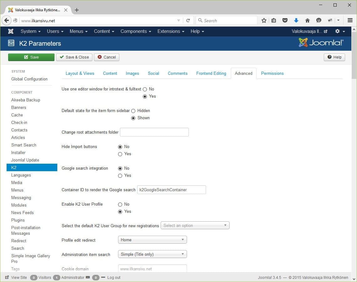
Other matters are also worth getting in order so that the pages appear in a good way to Google and other databases. It is also worth adding a short text description to every page in the field reserved for it. Then, for example, when the link is shared on Facebook, it comes with a suitable description of the page's content. Without this text, Facebook shows a snippet from the start of the page, and it often doesn't look very descriptive.
Looking for an image gallery
Maintaining image galleries should be easy, so I started looking for a suitable add-on to take care of it. Joomla's add-on search has almost 200 galleries, and on top of that other add-ons meant for presenting images. I examined almost all of their demos and most seemed really bad and otherwise lacking. Some seemed suitable, but a closer look showed they were lacking for my use.
Simple Image Gallery Pro is easy and pleasant from the administrator's point of view.
I even managed to buy one gallery plugin, and only practice revealed its deficient operation. Luckily I got my money back for it. Then I came across a gallery that used PhotoSwipe. The gallery itself had been made stiff and ugly. I thought I would just make a temporary gallery with it, copy the code from it and then have the site's template run it. But that didn't work the way I thought either. I didn't get a refund for this one, but the loss was under ten euros.
PhotoSwipe was still haunting my mind, but I started going through different galleries again, in case I would find one I liked this time. Among others I came across Oopstouch Slideshow FX, which was otherwise good, but would still have needed many kinds of add-ons to get everything working. The maker of Slideshow FX would even have been ready to make a few changes to the gallery so that it would suit me better. Unite Gallery also seemed promising, and anyone who wants a good gallery should definitely look into it.
Then I came across the PhotoSwipe plugin made by Styleware. This is not an actual PhotoSwipe gallery, but needs JoomlaWorks' Simple Image Gallery Pro as its companion. The set seemed so good that I decided to buy it. Simple Image Gallery Pro itself is the gallery engine, but the ten-euro plugin knows how to open the images in a PhotoSwipe window.
Simple Image Gallery Pro is easy and pleasant from the administrator's point of view. You can write a title and a longer description separately for the images. And in as many languages as there are language options installed on the site. In addition, an image gallery can be placed even in the middle of an article or a blog text.
After installation, however, not everything started running quite as planned. It turned out that two PhotoSwipe galleries were fighting each other. Even though I switched the template's own PhotoSwipe off in the template settings, it still interfered with the operation of the PhotoSwipe bought as an add-on. Styleware was helpful and gave instructions with which I got the gallery working in broad terms. So the gallery works otherwise, but enlarging an image doesn't work, at least not yet. Full operation would require removing all PhotoSwipe code from the template's code. This means problems when Gavick someday decides to update Quark.
Styleware also gave instructions on how to get the image title texts to show beneath the preview images. At this point it did feel good that the image gallery I had been searching for so long was finally beginning to work.
I personally consider it important that I got titles and captions on the images. Image galleries usually come without texts, and a good picture doesn't need explaining. But I myself like to read the information attached to a picture too, so I think someone else may want it as well. It is also easier for a search engine to find an image if text information is attached to it.
Gathering add-ons
Joomla has various add-ons and extensions on offer with which you can get functions on the site that plain Joomla or the template doesn't have ready. As usual, there is a suffocating amount of add-ons too. By exploring the add-on library you may find something useful that you didn't even know you needed. But if you have some particular thing or function in mind, then you just have to go looking for a suitable add-on. Some are free and some you have to pay for. Good options may be found among both. Or it may happen that a suitable add-on just can't be found.
Slider
A slider plugin suitable for splitting long articles was hard to find. A few options that looked good did turn up, but not one of them worked with Gavick Quark. They all scrolled the text to the end of the page, which would have made reading the text annoying. Of the paid versions, the developer of JU Tabs promised to make a change to the code if I bought the plugin from them.
So I bought this JU Tab and the developer gave new code. The new code, however, prevented the image gallery from working, so for the time being the slider is not in use. We'll see whether the money was wasted on this add-on.
Social media
Social media is a very large part of the present-day world, so you have to be there. But sharing your own content to social media must also be made possible. The template had its own options for this too, but they just looked like something I didn't like. Many other options were also just ugly, or otherwise so aggressive that I didn't want them on my site. AddThis could have been good, but the buttons were at the beginning of the article. I wanted the buttons after the article. If you like an article after reading it or want to share it, it is handy to be able to do so without scrolling back to the top of the page.
Social media is a very large part of the present-day world, so you have to be there.
Ultimate Facebook Social Buttons was then an add-on that could show the social media buttons at the bottom of the article in a neat-looking row. Although the add-on was paid, the price felt appropriate because it made the job neat and easy. But after installation the row of buttons looked an utter mess. Then I just sent a fix request to the add-on developer and almost in no time I got a reply with a corrective CSS style.
Interaction
Not everyone uses social media and some want to stay away from it. But I wanted to bring interactive elements for them, and why not for social media users too.
The ability to comment on blog texts and image galleries felt necessary. Even though I know it's not easy to get comments on writings. That is why commenting should be easy and effortless. K2 offers direct commenting, but it looks rather bare. That's why I wanted some better-working commenting in its place.
There is everything imaginable on offer for commenting too, and some are stylish and easy for the user. I did, however, ignore add-ons that require a Facebook profile or similar. Then comments would go unreceived if a potential commenter doesn't have, say, a Facebook profile.
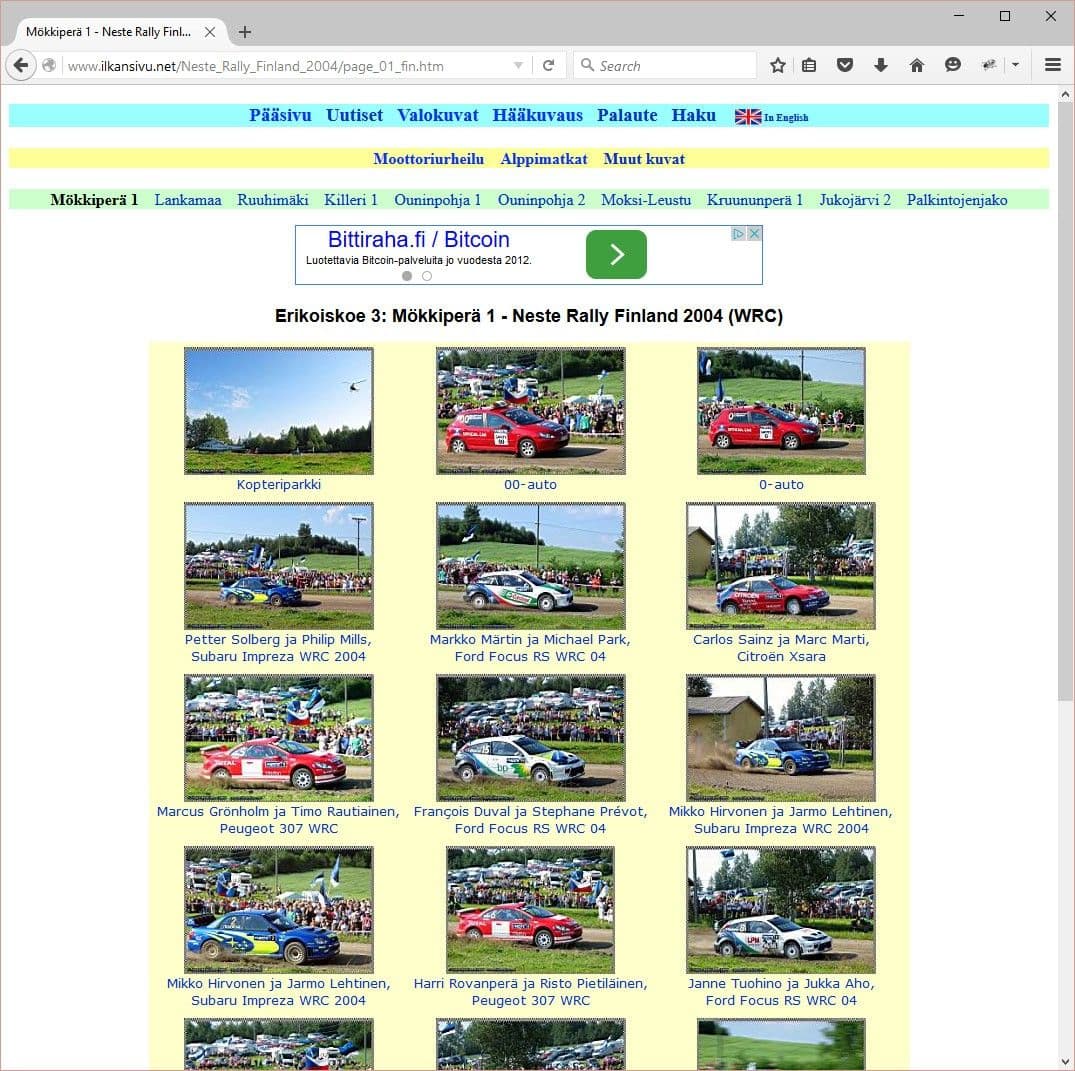
CComment and JComments were otherwise like what I was looking for, but their appearance, especially on a phone, was bare. That's why I decided to reject them and look for something else. In the end I ended up using Disqus, even though it can't be hosted on your own server. Disqus meets the other conditions nicely, though, meaning you can comment even if you're not on Facebook. Commenting with a Facebook account is also possible, but not mandatory. As a cosmetic flaw, Disqus works in only one language at a time, so I could not make this bilingual.
K2 also brought the ability to rate articles. The normal rating of Joomla's own articles felt stiff to me, although there would have been a good free alternative for it. Now the rating appears at the end of the desired article, which is a good thing. Joomla's default stars would be right at the beginning of the article, which in my opinion is the wrong place. After all, you can't rate an article if you haven't read it yet. Now an article, for example a blog text, can be given a rating by clicking a star below the article.
I also thought for a long time about adding surveys or votes. So I got CoreJoomla's Community Polls add-on, which I do intend to use in various situations as needed. It wasn't a cheap piece, but its functions seemed the best.
Sitemap
For making a sitemap there was a free program called Xmap. It makes a simple page with a link to every single page on the site. This is a small and light functionality that is considered a necessary thing in at least some circles. I rarely use a sitemap myself, but this may become useful as the amount of content grows. It should also have a favorable effect on search engine optimization. The look is a bit ugly, but let's try it at first.
Backup
When you have invested a lot of working hours in a site, you simply have to back it up. Not only the files, but also the database. Akeeba Backup is a free option that every Joomla developer should install on their site.
When you have invested a lot of working hours in a site, you simply have to back it up
Even if the service provider takes care of backups, data can always be lost for some reason. Malware or other vulnerabilities can also expose the site's content to loss. That is why a backup must be taken at least whenever the content is updated, and the backup should be stored at least on your own computer. If the backup stays on the server, it may well disappear along with the site if the service provider has a problem.
Making the logo
If making the site took time, so did making the logo. The first drafts had been drawn on paper a few years ago. It probably took a year for me to draw more and sketch out the possible shape of the future logo.
Dozens of different versions piled up before the right shape, pleasing to the eye, was found.
In the end a couple of figures went forward, and I then drew still more variations of them. The logo draft still had to be got from paper onto the computer, and that was done by scanning. But this isn't enough, because the pixel image had to be turned into a vector image that can then be freely scaled to any desired size.
A vector image can be made with Adobe Illustrator, among other things, and I happened to have it waiting. Although using Photoshop is familiar, I couldn't get beyond the beginning with Illustrator without learning it. And the learning went smoothly with Lynda.com's Illustrator course. Once I had gone far enough into the course, it was possible to start drawing vectors on the basis of the draft.
The original logo draft changed its shape a lot after the various drawing attempts. Dozens of different versions piled up before the right shape, pleasing to the eye, was found. It took months again, since I couldn't be at the computer all the time. But creative work always takes its time. And if you have no inspiration or next idea in mind, then it really is a struggle.
Finally the right shape was ready and then I still had to think about colors and other things. This turned out to be an easier job, and nice shades of blue were found relatively painlessly. These same shades of blue would also be repeated in the colors of the upcoming site.

From the logo I also had to make watermarks in Lightroom, which I would put on all the images going onto the site. By trial and error I found a suitable size and position. In gallery images the right place for the watermark is the lower right corner. That way, when viewing the gallery, the watermark doesn't badly overlap with the captions.
The watermark must not be too large, nor in the middle of the picture. As it stands, it is admittedly easy for an image thief to crop the watermark off, but I don't want to ruin the viewing pleasure with aggressive use of a watermark.
Content decides
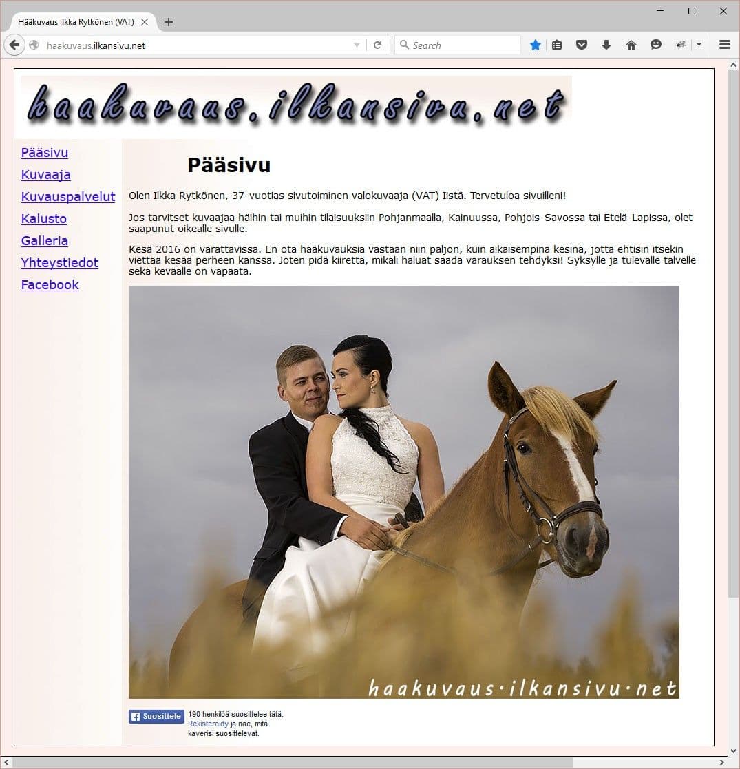
What good are fancy shells if the content is missing? I offer different photography services on the site. Previously I had offered wedding photography services on its own site. At first I thought of still keeping wedding photography separate, but then I thought of combining it into this same site.
The most impressive viewing experiences come when the picture fills the whole screen.
Wedding photography is nevertheless its own item in the menu, and not in the same place as the other photography services. Wedding photography has, however, been the only photography service that I have actively offered and marketed. Now I want to offer something else too. Perhaps at some point I will put wedding photography among the others as one photography service, but for now this solution feels suitable.
Image galleries are an important part of the content. Some of the galleries also include travel stories. Travel stories could on the one hand also be part of the blog, but on the other hand travel stories are quite naturally included among the pictures.
And what about the size of the images? I have noticed that I can't be bothered to look at image galleries at all where the pictures are the size of a postage stamp. The most impressive viewing experiences come when the picture fills the whole screen. So I ended up setting the longer side of the image to 1920 pixels, according to Full HD resolution.
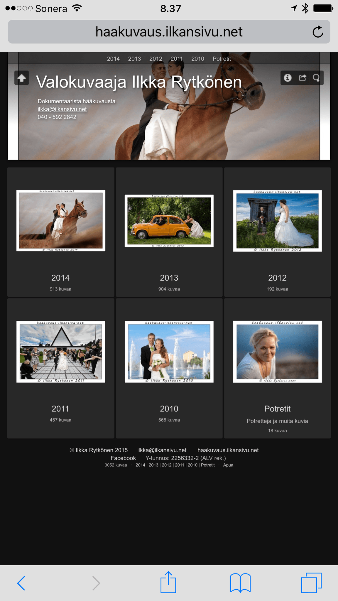
The compression level of the JPG image also had to be considered to make it suitable. It's not worth putting an image of too high quality on the net, good enough is enough. So what is good enough? I tested different compression levels and Lightroom's quality level 65 produced suitable results. Small details didn't yet turn to mush and it also reduced the file size. Files that are too large also eat into the web hosting's monthly available bandwidth, so for that reason too it made sense to find a suitable balance between image size and quality.
Blogging
Starting a blog has been on my mind for a long time. Now it began with this post. The subject matter will be strongly cameras and photography. But other subjects will surely come at some point too.
Through work I get my hands on new models fresh off the line, so writing about equipment is easy accordingly. Equipment comes to market at such a pace, though, that I certainly won't have time to test everything, but that isn't the point either. I write about the products that I consider important to myself or that are otherwise just interesting.
What do you think, is there still room or need for a new blog, or is there already enough on offer?
User interface
Doesn't it suffice just to add content? No, it doesn't. The site designer's job is also to make the navigation, i.e. the menus and so on. Developing a suitable menu structure and working navigation also played an important part. Now you should be able to get everywhere easily with one or two clicks.
The menu would look quite full on a phone, because the whole menu structure with its submenus opens onto the screen at once. This is a slight problem, but I prevented the second-level menus from showing on phones. The second-level menu is then its own module after the article, so on a phone too you can surf everywhere.
As image galleries and blog texts increase, some things may have to be changed. But there are already a couple of things waiting even now. For example, you can get directly to the previous and next blog text from the end of the text.
You can look for lessons at, say, Maikkari's site. Every time they have made changes there in recent years, using it on a desktop computer has gotten worse each time. If you want to read MTV's news, you have to use the mobile app. That is a situation I wanted to avoid.
Bilingualism
I thought about whether the site should be made bilingual, as the previous one was. If the site were in Finnish only, it would make the job much simpler. Adding a second language always adds work too.
However, I wanted to offer the pages in English as well as Finnish, because that brings more visibility too. Content or image galleries written only in Finnish are not necessarily shown by Google outside our country's borders. Writing in English also improves language skills. But at this point it seems I probably won't have time to translate all the blog texts. For starters it is enough that the site is bilingual in other respects.
Final conclusions
Now that I have experience of building one site, building a new one would already be much easier and I would know to take things into account from different angles. I would now choose the template on different grounds, because I know a suitable image gallery. With a different template some add-ons might also become unnecessary. Or the add-ons that do not work in the current template might work. But you can't know that without trying.
I would now choose the template on different grounds, because I know a suitable image gallery.
It would help to learn more HTML and especially CSS. With these skills, getting small things just the way I want them would be much easier. Luckily the forums or the add-on developers help those who don't know.
Developing and maintaining a site seems to be a rather endless operation, but an interesting one. You have to keep up with how web technologies change and develop. At the same time you can think of new functions for the pages as needed with new add-ons, or replacing old ones. As the content grows, a surprising need for new functions may arise.
The images on the new site are now clearly larger than before, so I will probably have to upgrade the web hosting package to a bigger one at some point. And not only in terms of storage space, but the monthly traffic capacity also threatens to run short.
It is surely better to stop this text here now, so that it doesn't stretch out quite impossibly. Do write your own thoughts about these pages or this blog in the comment field. Or just click a star.
Finishing the new site was quite a big job, and I haven't even had time to take pictures for a while. But now that the site is ready, I can get back to my hobby.
Index, follow.